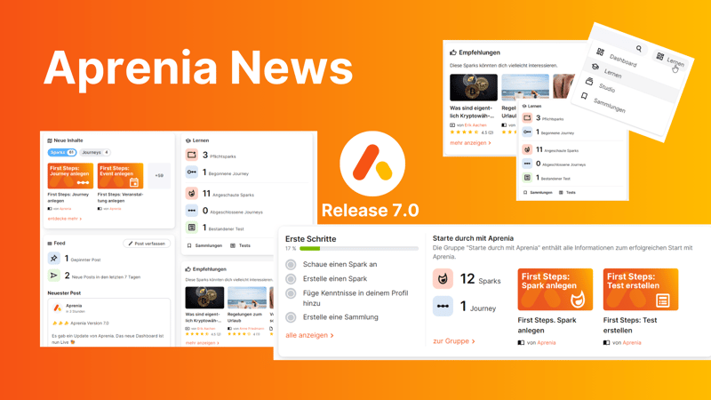
U2D Aprenia 7.0 comes with new dashboard
U2D Aprenia is updated at regular intervals. Bugfixing, small changes based on customer requests or major usability changes. U2D Aprenia always stays #up2date. Learn everything about the new feature of the revised dashboard in this blog.
The old start page
With the last major update to 6.0, the LXP U2D Aprenia got the feature "Create Events". This allows you to manage appointments and events, add events to journeys and use a calendar to manage appointments. But as is well known, after the release is before the release. So - after a release of smaller interim updates - work has begun on a new theme which, due to its size, will meet the switch from 6.4 to 7.0. When developing an LXP, the top priority is to respond to customer experience. Customer feedback on the now "old" dashboard brought the realisation that the dashboard needed to be revised.
Prior to Release 7.0, the dashboard was a collection of lanes. It included an overview page with the categories "Recently Viewed Sparks" and "Recommended Sparks", the latter consisting of an AI-generated selection of sparks. Below this was the "Tests" section, which displayed tests to be taken.
Feedback on the dashboard was that it did not "handhold" new users enough, but simply presented them with a collection of sparks. However, new U2D Aprenia users rely on the system itself to introduce them. Experienced team members could of course help out, but then the goal of independent knowledge transfer would not be given.
Changed menu
Due to the "simplicity" and usability issues, it was therefore time to redesign the dashboard from scratch in order to present an improved user experience. Therefore, the presentation of the U2D Aprenia menu items was also adapted to the new dashboard. The menu item "Learn" has a new sub-item. The new sub-item with the same name "Learn" leads the user to the old start page - the old dashboard. Here, users now receive personal savings recommendations based on their previous behaviour, which they can use to boost their knowledge transfer after familiarising themselves with the LXP.

Structure of the new dashboard
The new dashboard, like the old dashboard, can be divided into two sections, one of which can be "removed" in different ways. The dashboard is composed of "Getting Started" and a main section.
„First steps"
The world of LXPs and independent knowledge transfer is a fairly recent development in the digital learning culture compared to other milestones in e-learning. Therefore, the top priority for applications like U2D Aprenia is user-friendliness and the aspiration to let people learn completely independently on the screen. However, autonomy through technology must be implemented very precisely if a company wants to achieve that as many licence users as possible use the system interactively. The individual evaluation of a programme stands and falls with the handling of the "first steps". While version 6.4 did not have a guided "tour", this has now been implemented in 7.0.
"First Steps" is again made up of two areas. On the one hand, in the "Tasks" section, to dos can be defined that new users have to complete if they want to have a successful and sustainable introduction to the platform. In addition to these first "compulsory tasks", sparks can also be compiled to explain the functions of the system.

The "First Steps" can be deactivated by individual users in the profile settings (both before and after their completion). When the introduction is completed, they are no longer necessary and it is recommended to deactivate them for an improved overview of the rest of the dashboard. Administrators have the option of deactivating the function in general.
Main part - the actual dashboard
The new dashboard is arranged in tiles with different categories. These so-called widgets form self-contained features on the one hand, and on the other hand they are intended to highlight existing features more. The widgets can be arranged individually. It is also possible to show and hide individual features. Ten widgets will be made available for the new dashboard at the time of release - but more are already being worked.
Some pictures of the new dasboard:
Widget overview
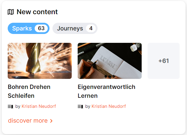
- New content: This widget displays a summary of new content. Within the tile, you can switch between the preview of Sparks, Journeys or Events. Two preview examples of the three categories are always displayed in the widget itself. The display is dynamic and depends on the topicality and popularity of the element. Clicking on the "discover more" button takes you to an overview page with all new content.
- Experts Q&A: The classic Q&A element is now brought to the new "start page". While this feature used to be rather hidden, it is now much more prominent in the dashboard. The expert Q&A is used to solve questions that cannot be answered by content through other users.
- Feed: News can be shared here with postings, similar to social networks. Its dashboard function shows the latest or most popular feed entry. If the staff is silent and no feed post is available, a prompt for setting a feed post appears.
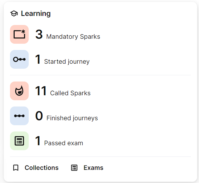
- Learning: This widget is one of the most important. "Learning" provides an overview of personal achievements in numbers. This includes the Sparks viewed, Journeys completed and tests passed. At the same time, links to "Collections" and "Tests" can be found at the bottom. These serve to move from the tile to deeper levels of individual learning. In the upper area, the things to be done fall into place. When this is done, a picture of the current time of day appears, depending on the time.
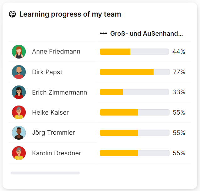
- My team's learning progress: This new feature is intended to illustrate the progress of the team in which the users are located and to fulfil the task of the management tool. At the latest when all the other team members are further along than you are, it's time to catch up! Catch up!
- Rate spark: It is important for the degree of professionalism that sparks can be rated. The better a Spark is rated, the more likely it is that more people will consume it because, in turn, the good rating suggests a quick solution to the question posed. After a Spark has been completed, there is an opportunity to rate it on the Dashboard five days after completion.
- Birthdays: All upcoming birthdays are listed here according to their actuality. In compliance with DSGVO, this widget is based on a voluntary basis. If you take a look at U2D Aprenia every day, you don't have to keep all birthdays in mind - or transfer them to a calendar..
- New colleagues: Everyone knows it. You run into your new colleague in the corridor and don't know his or her name yet. How to start small talk? With the "New Colleagues" widget, new colleagues are introduced on the dashboard and with regular use of U2D Aprenia, the new names should be quickly remembered!
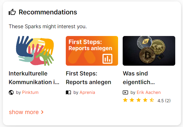
- Recommendations: Of course, the recommendations must not be missing on the homepage, which is why they have remained as tiles and recommend sparks to users that might interest them.
- Leaderboard: Last but not least, the leaderboard brings the gamification factor to the homepage. The best profiles of the last thirty days are displayed in a list. In this way, internal party knowledge battles can be examined day by day (with a fun factor, of course).
The dashboard generally serves to promote and simplify interaction. It is also intended to give new members (and old ones) a better overview of the application. With the new dashboard in U2D Aprenia, you and your employees have the chance to take a modern approach to e-learning on the one hand, and on the other hand, the platform has the potential to prove itself not only as an LXP, but also as an internal social network in which your employees can settle into the company even better.
Last features from Release 6.4
These are the latest updates from the U2D Aprenia 6.4 version:
- Images for groups can now be cropped and the image transfer from Unsplash has been optimised.
- Attachments of a Spark are now displayed directly below the Spark content.
- People are displayed as a map in the search. Additional information can be displayed in this.
- When opening a Spark from a Journey, the next Spark of this Journey is displayed below the content.
- The display of questions and FAQs of sparks has been optimised.
- The pass status of e-learnings is displayed within the Spark.
- The Spark lists the groups in which this Spark has been included.
